Case Study | Sprint Challenge
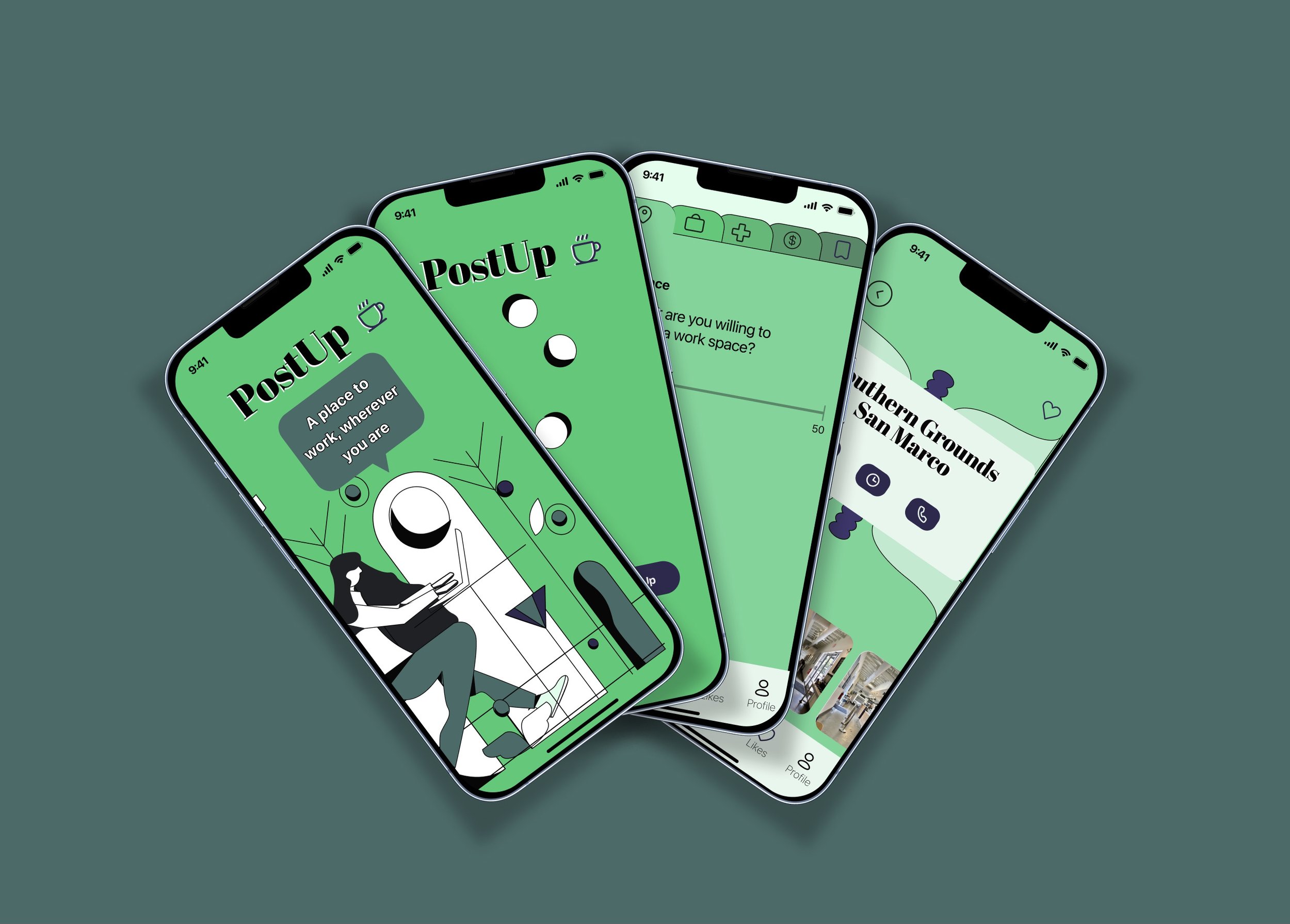
PostUp
Native Mobile iOS: Discovering Alternatives to the Home Office

Introduction
My role
UI/UX Designer
Overview
This project was a modified Google Design Sprint (GDS).
Constraints
Working with Bitesize UX. They provided the interview notes, personas, and Postup brand colors and company “must haves”
Brand must have monthly subscription
Mobile application only
Help users find places that already exist
1 week to complete the sprint
Research: Understanding Background and Builidng the Foundation for a Great User Experience
PostUp wants to make it easier for remote workers to find public places to work at
PostUp is a new startup where freelancers and remote workers share tips and advice. Their feedback forms and discussions forums have shown that many have an interest in finding public places to work at. They want to rebrand and center their platform around finding public places to work at.
During our interviews, we identified the common steps people take to find a place to work
This step played a pivotal role in our feature prioritization. Our objective was to streamline this process by minimizing the need for extensive searches and instead offering readily accessible locations that align perfectly with their needs.
We created Nina to help keep the design process focused on the behavior, preferences, and pain points of real users
Nina helps ensure that we provide a relatable and concrete representation of the target audience, ensuring that the product is designed with our users in mind.
I looked at indirect and direct competitors to determine what’s been done and what I could implement on PostUp to make it better than the competition
My goal became to build something with the filter capabilities of Lunchclub, visible reviews and amenities like Yelp, and table availability like that found on Resy or Opentable.
Synthesize: Creating a User Flow
Optimizing the Flow to Enhance Usability
I kept the flow focused on the main route: “find a place” in an effort to restrict myself from getting carried away with all the possible functions the app could take on.
I chose to create a user flow to better visualize the path a user would take on PostUp’s “find a place” red route to know what screens need to be created during the wire framing process.
Ideate: Creating Sketches and a Storyboard
I did crazy 8s on Notability to quickly come up with my most important screens:
criteria page and results
Generating Quick Ideas
To increase usability, I thought this application’s interface would benefit by reflecting Yelp, and other applications, that help users find places to go by using a criteria based filtering system.
This app, unlike Yelp, is geared solely towards places to work, not to find places to eat or meet up with friends. When someone downloads PostUp, they want to quickly find places to work. With that in mind, I believed a criteria screen would be the most important screen to create.
At this stage the main question I had was how to minimize any frustration that comes with having to plug in information repeatedly.
Solution: save criteria option
Visualizing the User Journey
To conceptualize, refine, and communicate the user experience more effectively in my app I created a storyboard on Notability. This step proved essential to “get in the head” of my user.
Prototype: Building Wireframes and Style Guides
Creating Consistency
I created a quick style guide using the relume library’s typography style guide as a template and adjusting it to fit my vision for PostUp. I used a monochromatic palette for the most part (used Space cadet #2E294E for CTA buttons).
Setting the Mood
I used shades of green and space cadet blue to communicate sophistication, abundance, and also imbue an energizing, fresh, and fun feel to the interface.
Touching Upon Accessibility
SF Pro - easy to read in varying pixel sizes.
Abril Fatface - used for the company name and headings of places to reinforce the application’s energizing, fresh, and fun feel.
Creating Screens to Test
I wanted my wireframes to imbue a relaxed and modern feel on the user. I sourced illustrations from the Figma community and tweaked the illustration’s color palette to compliment the company’s colors.
As I designed, I tried to maintain accessibility for those with green color blindness by darkening the shadows and including a stroke around everything to help it stand out.
My goal with the screens: to create a flow that felt slightly unique, yet relied heavily on conventions established by Yelp and other applications that provide similar services to PostUp.
For instance, during the interview conducted by bitesize UX, the interviewee mentioned that they want to know how busy a place is before they commit to going there.
I designed a screen that resembles Google's busy meter, but later, redesigned it to reflect the needs of the interviewee and depicted available tables instead.
I tested the app on 5 individuals (one of which has green color blindness). Each participant either previously worked remotely or currently does, and have done their work at coffee shops or other public places.
To satisfy PostUp’s goals of helping users find remote places to work at I presented each individual with the following tasks:
Login to Postup
Subscribe to the monthly plan
Insert criteria to find a place to work at
Select Southern Grounds
Find current occupancy at Southern Grounds
Find directions to Southern Grounds
Leave a review for Southern Grounds
Subscription to the monthly plan
Fill in criteria to find a place to work
Check occupancy
View the Figma prototype
Unfortunately, one of my testers got sick so I had to scramble to find someone to replace them. Other than that hiccup, the testing phase went off without a hitch.

UI Improvements
Darker interactive state
Larger arrow icon, drop shadow for button, shop names shortened
Labels for icons
Concluding Thoughts
My test proved that my app, although it has a few downsides, it is simple to use overall
Lessons Learned and Other Thoughts
Even the participant who has color blindness chimed in that everything was laid out simply and visibly. Although I received copious positive feedback, there is plenty of room for improvement.
Create more routes (sign-up and onboarding screens) and include edge cases
Explore whether or not the option to click on the final star of a rating instead of bubbling in one at a time is a good function to include
Explore if a next button on the criteria page is necessary
Tree test the navigation
Isolate which features are exclusive to a subscription/research what features people would subscribe for
Include my illustrations in the interface
By the end of the week I felt like I had a pretty good taste of a google design sprint. Having parameters in place prevented me from deviating from the main task and kept me focused on producing a finished product quickly.The only thing that took away from the experience was:
Working in isolation and without a team to bounce ideas off of. Despite that, I enjoyed the activity, with my favorite aspect of the project being the constraints.


